Update 1: 09.11.16
Update 2: 26.12.16
Update 3: 05.01.17
While doing research for my Oriental portraiture shoot, I came across the Lavazza advertising campaign which I had found some relevance to my works. After initial research, there are three photographers whose works I had to analyse here.
Lavazza is an Italian manufacturer of coffee products and one of the largest coffee producers in the world. to increase brand awareness abroad and promote its premium positioning, an art-house photographic calendar has been produced since 1991, featuring fashion photography from some of the world’s leading photographers which have become a showpiece of conceptual fashion photography.the creative form of the calendar has been closely connected to the world of art than traditional advertising.
The Lavazza Calendar has enjoyed noteworthy successes, which has increased exponentially over the years. The Calendar has featured in numerous articles worldwide, all of them extremely positive and authoritative, making it one of the most talked about and recognised.
The layout dimension of both its calendar and advertising material have been mostly in 5″x7″ aspect ratio. The calendar images are 2″x3″ ratio while the advertising images are almost 1″x1″. This is particularly important as to how these photographers composition their images.
Photographers
Finlay MacKay
Born in Scotland, 1973. After the studying, he moved to London, where he became an assistant to photographers such as Elaine Constantine with whom he worked full-time from 1999 to 2002. His first photographs revealed a highly original and innovative style that draws inspiration from the street art and comics, as well as from more classic English schools of painting.
Eugenio Recuenco
He was considered one of the most creative contemporary photographers in Spain, famous worldwide for his works in the publishing and advertising fields. His highly personal style has been defined as “cinematographic” and “pictorial.
Steve McCurry
Steve McCurry, recognised universally as one of the finest image-makers today, is best known for his evocative colour photography. In the finest documentary tradition, McCurry captures the essence of human struggle and joy.
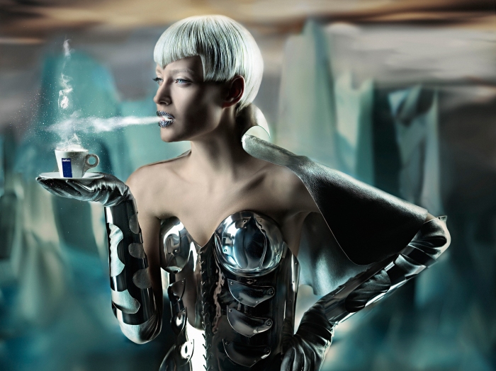
Lavazza Calendar 2008
Photographer: Finlay MacKay
Fashion Stylist: Hannah Teare
This theme “The Most Majestic Espresso Experience” was dedicated to important, aristocratic and determined women, women who feel like queens – in other words, all women. It shows an enchanted and precious world in which queens are surrounded by jewellery, silk, velvet and freely roaming animals proudly reign. For every respectable queen has her king, and the king of the calendar is Lavazza espresso. In addition to creating a pretty piece of functional art, Lavazza’s flash website for this calendar had both a written and narrated story introduces us to each of the “queens” in the calendar.
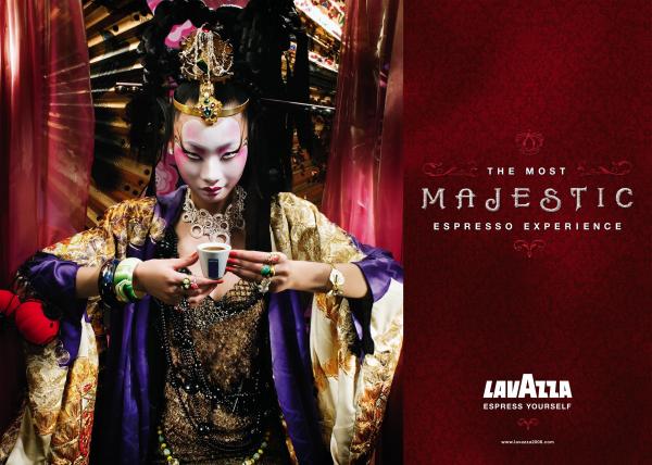
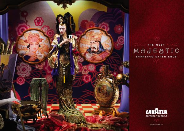
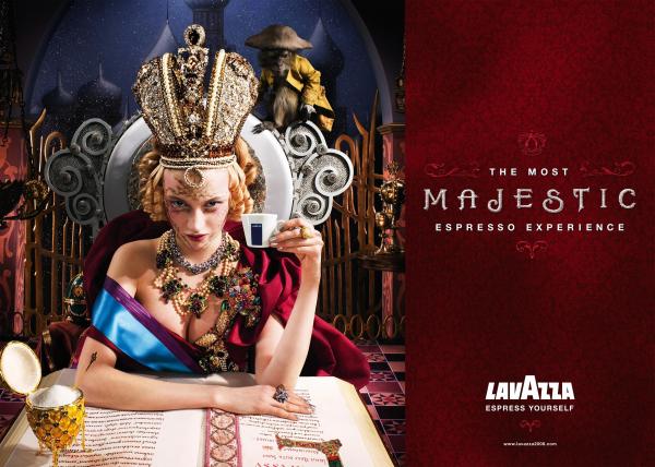
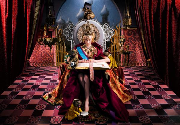
Finlay MacKay was the photographer for the Lavazza Calendar 2008 edition. His photographs reveal a highly original and innovative style that draws inspiration from the street art and comics, as well as from more classic English schools of painting.
When I looked at his works, I thought immediately thought about the sumptuous backdrops and the elaborate costume set designs that made up the surrealistic atmosphere. The majority of the colours fall along the warm colour spectrum with a tinge of complimentary colours, probably because of the nature of the theme which was to create a sense of royalty. With their seductive glances, these professional models have done well keeping their expressions and body postures, as though beckoning us to their courts for a real majestic experience.
Finlay McKay has also done various shots in one set, notably one close up of the queen and one wide angle view, revealing the whole scene where the queen is. The details in the background, those “royalty” props also add up to create a sort of narrative story about these wealthy queens, thus inviting viewers wanting to know more about their background and how it relates to the majestic experience.
The other contributing element to the narrative story is the use of lighting in each set. The use of highlights and shadows, in this case, are well controlled. They are not high key fashion shoot nor too low key. There is a bit of side lighting which reveals partial highlights on one side of the subject’s face, and other lightings on the props to highlight details and create depth.
The video below shows behind the scenes of how Finlay McKay conducted the shoot, as well as the team behind the entire project.
Lavazza Calendar 2007
Executive Creative Director: German Silva
Creative Director: Haitz and Ekhi Mendibil
Art Director: Andrea Lantelme
Copywriter: Cristiano Nardò
Photographer: Eugenio Recuenco
The theme “The most incredible experience” was set in a lawless city, sensual superheroines made unstoppable by Lavazza coffee are the subject of the Eugenio Recuenco calendar. This gives a sense that when consumers drink their coffee, they can also become the stoppable heroes and heroines.
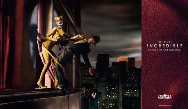
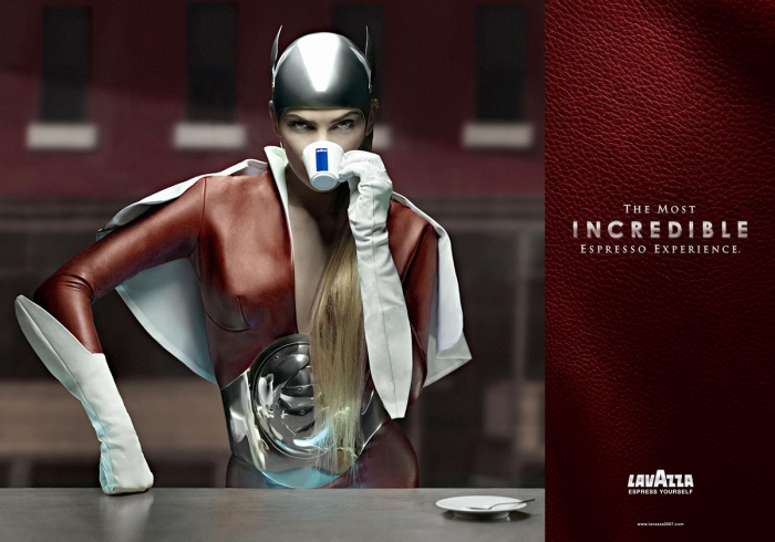
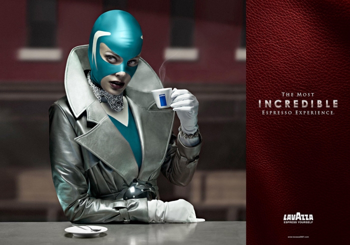
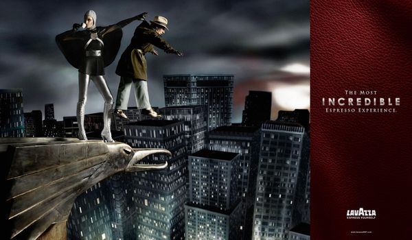
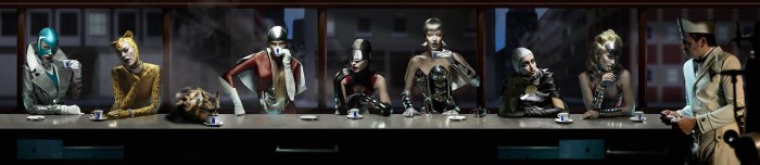
Eugenio Recuenco was the photographer for the Lavazza Calendar 2007 edition. When I see these images, I looked at the narrative aspects: how Eugenio Recuenco creates these narrative scenes. His photographs here reveal a story, time and style being embedded into an environment of American skyscrapers and superheroes prevailing in the comics. The calendar features seven heroines, calmly sipping espresso in a New York coffee shops and scenes.
The masterful use of light and colour in every image are very suggestive. The lightings in each set create a sense of the Noir element, an atmosphere which essentially combines the psychological narratives with action. However, those shadows are not too dark and shadowy. The narrative aspects of these images are almost theatrical.
The costumes of these models say who they are. Their body poses in different scenes say what they do (or what their powers can do). The way they drink from their cup reflects a lot about the heroine character. Hence body poses, costumes, expressions and lighting are some aspects which contribute to the narrative story behind each image. These stylised pictures feel more like paintings or graphics which gives the viewers a strong feel of experiencing the scenes, an impression as though they were in the set of events.
I think this is because Lavazza Advertising campaign was focusing on enticing the American market and the criminal setting was a good marketing strategy for the American consumer as well as the general people who loved hero comics. At the time, these ads had appeared during the period of Christopher Nolan’s Batman films: Batman Begin (2005), The Dark Knight (2008). Thus, Lavazza has asserted its relevance to the American pop culture then.
Lavazza Calendar 2015
Lavazza Corporate Image Director: Francesca Lavazza
Armando Testa Executive Creative Director: Michele Mariani
President and Founder of Slow Food: Carlo Petrini
Photographer: Steve McCurry
The 2015 Lavazza Calendar “The Earth Defenders” by Steve McCurry is a photographic journey that recounts the everyday heroic stories of the Earth Defenders: men and women who with courage, pride and dedication are defending their projects in Africa. It reflected these heroes who have been fighting for this purpose as well as the well-being of the African people, protecting them working on the land from exploitation. This calendar was created in collaboration with the Slow Food organisation, which represents the promotion of the welfare of healthy food and the people who work with food (coffee bean pickers, farmers, etc.). Lavazza and Slow Food are thus supporting food traditions and siding with all Earth Defenders, who are a beacon of hope for local communities, ambassadors of a feasible development and a better future.
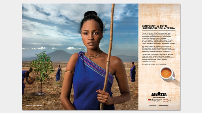
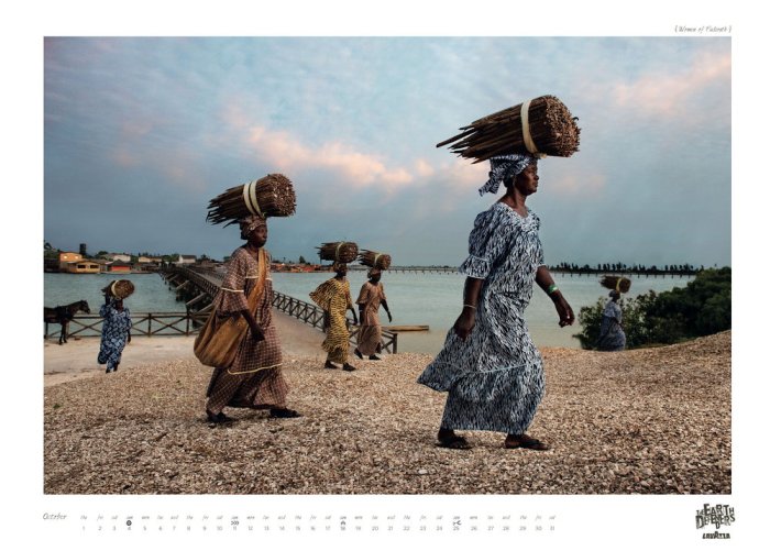
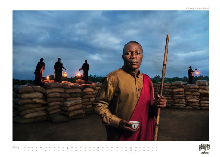
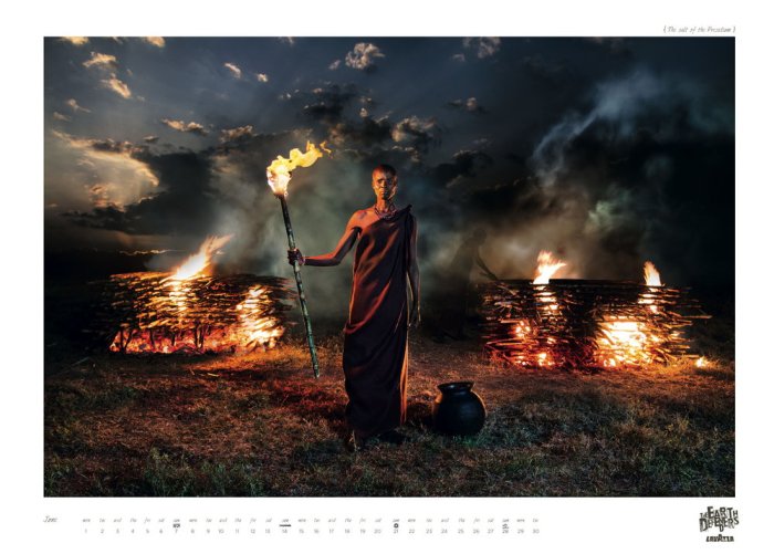
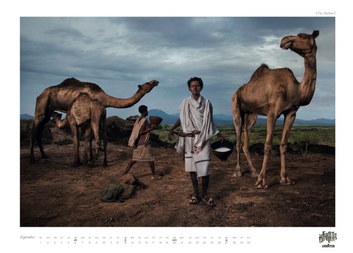
The project of this calendar, as compared to the previous years, Lavazza seems to have shifted from a high-end advertising campaign to an activism campaign with strong messages; from the sensual advertising about making consumers “feel good”, to the “real issues” outside the consumer context. Hence, Lavazza and its teacup no longer become the focus, but rather, the people who worked with food. It has become a cultural project and sustainability of high artistic value.
While Steve McCurry is no longer a photojournalist but a masterful visual storyteller, it is clear how he had translated these images into a narrative story. By breaking it down into twelve images, one for each month, there is a specific theme or story that captured the essence, the emotional side of the life of these people. Even though it is obvious that these subjects are directed by the photographer, McCurry’s images, in fact, do speak with strength and the emotion of people, places, unique stories, achievements and coffee, but above all, the initiative to become a reality.


