Developmental Process: Allemannsretten

Allemannsretten is a Norwegian concept from the ancient times which means “the freedom to roam” in English. Simply defined, this traditional right takes on the form of general public rights which applies to open country, thus making it legal in most cases for people to walk through any piece of uncultivated land. This concept rings true for tourists exploring any new places for their first time, not just open spaces, as it may give them a sensory impression of the whole outdoor experience. I came across this term in a bookstore in Reykjavik, Iceland and thought it fitted well on how I made the majority of the landscape images and what I was interested in.

This series forms part of a larger overarching theme, ‘The provocative landscape’ whereby I have been working on for two years, accumulating the travels and experiences of roaming about these locations for my first time and exploring places through the tourists’ eyes, thus informs my impression of the landscape through personal experience and in turn translated into photography.

To know more about my travels:
London | Scotland | Barcelona | Dubai | Singapore | Berlin | Iceland

(Some of these image in the series were not printed out as part of the final series because I have to consider the balance of my portfolio in the bigger picture. I have three collections of prints hence I have to be conscious of omitting those with the weakest links.)

References

The references to this series is an accumulation of the photographers or image makers that I have analysed over the course of two years of endeavour; Some in the form of visuals and themes, some in the form of philosophy and photographic practices while some are cultural influences. But at the same time, I didn’t want to simply emulate their style, or copy them. Instead, I wanted my own photographic style to come out of its own, while still influenced by these photographers.

(For more information about my research and references, check out my bibliography page.)

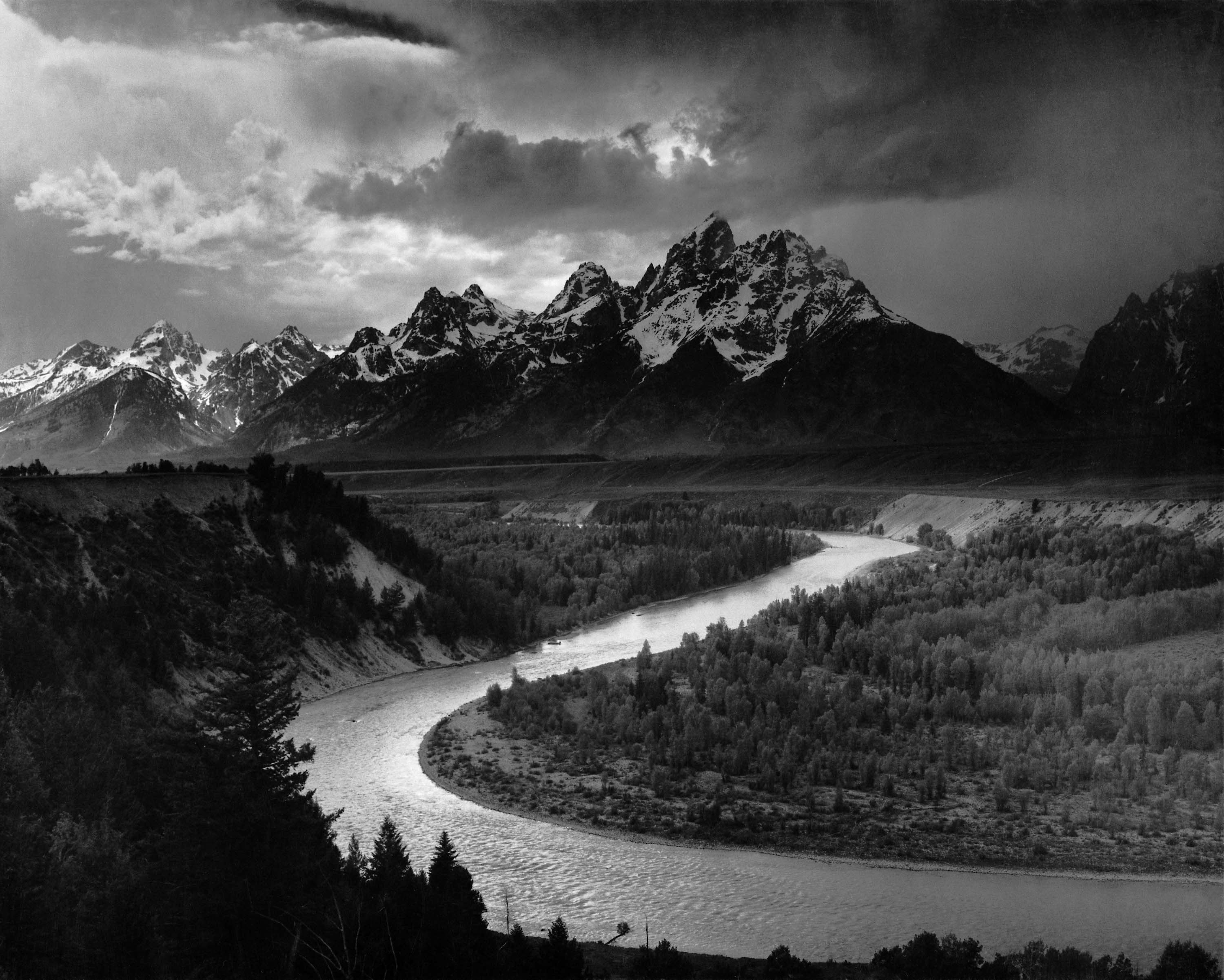
Ansel Adams | His dedication, and experiences in capturing the landscape has left me captivated and wanting to understand what makes his images work. As I had first started with the love for landscape photography; his idea of pre-visualisation and his preference for black and white images had me re-look at my own practices in photography. [Analysis]

Saul Reiter | Believed there is such a thing as ‘a search for beauty’. He considers it worthwhile for one to pursue their perceived forms of beauty. [Analysis]

Edward Burtynsky | Heavy influence from Edward Burtynsky’s photographic practices: “[we] come from nature… There is an importance to [having] a certain reverence for what nature is because we are connected to it… If we destroy nature, we destroy ourselves.” [Analysis]

Dan Holdsworthoften quite interested in dislocating the image from the place.  He was interested in is a psychological landscape’, not so much in where it is located. his works represent an updated notions of the Romantic Sublime, with “elements of awe, vastness, individual insignificance, of trespass even, are appropriate to these … wildernesses.” [Analysis]

Finn Beales | His image style always gives an authentic and natural feel, there isn’t too much heavy editing. He has a keen sense of how lights affect the landscape and use that to his advantage, thus using the lights to create the atmosphere. [ Analysis]

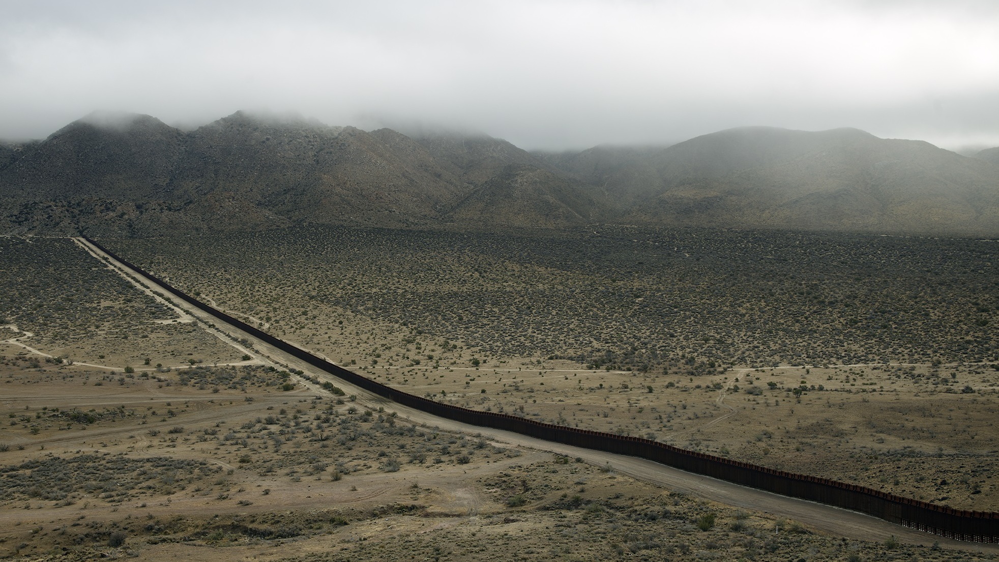
Richard Misrach | One those image which perhaps I felt most connected to was The Wall, Jacumba, California, an image Misrach captured in 2009 which depicts the U.S.-Mexico border often show a fence and desolation on either side. The clouds covering the mountain ridges suggests the scene with an ominous atmosphere. It has that depth which conveys the scale of the desert terrain. It is not vividly coloured, but there are a lot of details hidden within the landscape which might provoke one’s response into thinking what is there within those vast spaces. Hence from this image, Richard Misrach’s works suggest a dialectical image. [Analysis]

Paul Seawright | Seawright’s works “Hidden” is relevant to my research because of his subtle and quiet approach in capturing the terrain suggests that where there lay a hidden malevolence of its landscapes and the spectacle of ruins which becomes aestheticized, an approach which contrasts against that of Luc Delahaye’s works. [Analysis]

Simon Roberts | By elevation, it lifts the mid-ground and gave him a better opportunity to see the landscape and build narratives into it. By photographing the theatrical and using the atmosphere to his advantage, the less likely for him to get stopped taking pictures. [Analysis]

Other Research 

Toussaint (The Witcher 3: Blood and Wine) | This is one of the many beautiful video game worlds that I enjoyed watching. Though I’m not really a gamer myself, but the art is beautifully rendered, the stunning vistas and brilliant sunsets. Landscape images can be a source of influence for video game environmental designs and vice versa. This also shows another potential revenue for landscape images.

Hebe | Chinese Pop singer and Idol, Hebe and her Music Video: Insignificance

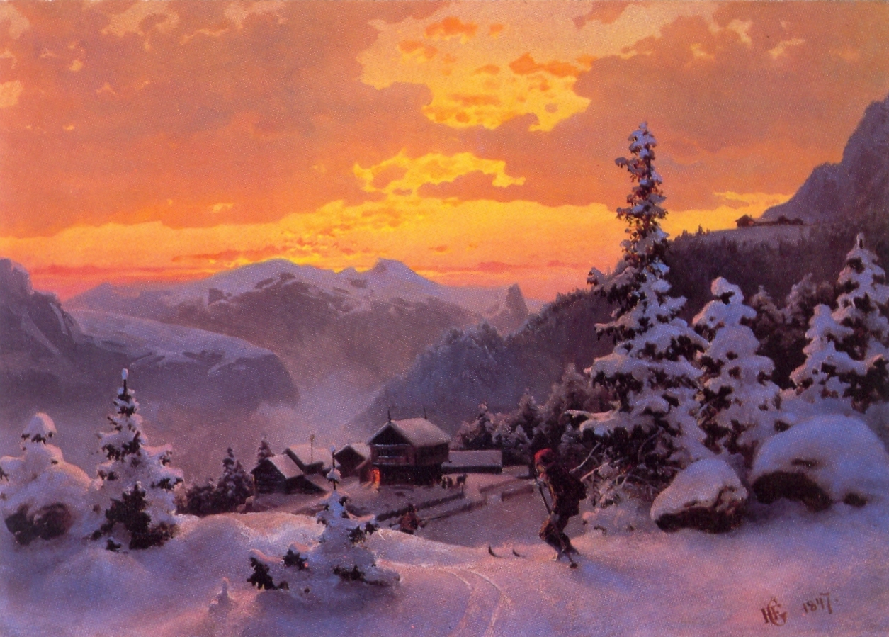
Impressionism and Romanticism Arts Movement


Paintings from these art movements have given me an impression of what the European landscapes could be like, therefore shaping my photographic practices and the preferential visual to dramatic landscapes and snowscape terrains, as I have subconsciously tried to emulate these art styles into my landscape photography. [Analysis]

A Curated Series

My approach to Allenmanstretten was to curate my images from all of my travels and look at landscapes in the opposite direction of my original photographic style. The vivid colours in this series are largely absent in my images. There are certain elements of detail hidden in the visual that I hope the viewers may take a second look. There is also that certain element of commercial value of travel photography amidst the fine arts approach. This is intended, as the essence of my travel is encapsulated through these experiences.

oowenphoto-berlin-4

A shortcut through the small canal behind the Berlin Zoo with sheets of broken ice in interesting positions. The calm water presented a serenity of the scene as a train passes through the vicinity, echoing its presence. That was the moment, Henri Cartier-Bresson style.

Edit_BA10

  1. as usual, I blended the three exposures into a single image, colouring shadow area with the underexposed image and highlight areas with the overexposed image.
  2. I then use the curves to pull in more contrast, and colour adjustment filter for a cooler tone. This process is used throughout to balance the colour of the snow.

oowenphoto-berlin-1

Wandering through the Tiergarten park exploring the wintry landscape of Berlin, I found a playground in the midst of the white open space, covered with a thin layer of snow. I  captured the scene in a two-dimensional form, utilising the strong visual lines of the playground and the trees in the background.

Edit_BA8

  1. The image was originally framed with the rule of thirds in mind. I used bracket exposure to bring back some detail of the overcast sky.
  2. noting that there was a single yellow hue visible in the image, I used the HSL to push the yellow hue out.
  3. I applied curves adjustment to create a punchier contrast and colour balance filter with cool tones to balance out the colours in the image.

oowenphoto-berlin-5

A street scene off the edge of Tiergarten park just before the Holocaust memorial. Having submitted my dissertation report just before my Berlin trip, the subject of war tourism and the research of war photographers in my essay were still fresh in me at the time. These forests gave me the world war two impression vibe as it had reminded me of the calm scenes of the miniseries, Band of Brothers (2001), just before the bombardment at the Battle of the Bulge in episode 6. Having done my two years of full-time National Service stint, I cannot imagine myself in those circumstances and I do not want to put myself in that forest. I  captured the scene in a two-dimensional form, utilising the strong visual lines of the traffic lights and the trees in the background.

Edit_BA7

ccfvvvfdvfv

oowenphoto-iceland-13

At the black sand pits in Iceland, a strong gust of wind picks up and everyone froze still, not wanting the sands to hit on their faces. I wanted to capture the scene of the people heading in the same direction towards a cave but they are all in an awkward standing position, hands covering their face from the sands.

Edit_BA8Not much editing was done on this images, but largely to open up shadows and control the highlights in camera raw file.

oowenphoto-england-19

This was the first time I have captured fog at the Mousehold Heath forest, Norwich. I think this stems out from a conversation I had with an acquaintance of mine back in Singapore about “printing wallpaper for hanging”. What he meant was about wanting to purchase fine art prints from me, while I showed him a couple of random wallpapers as a reference to what he actually said:

I didn’t know the author of the misty forest wallpaper in the reference image, but when I on the ground shooting the fog, I was probably trying to emulate the same atmosphere in the panoramic format; the strong verticle lines of the trees, the same crispness in the foreground and the blurriness at the background. In this case, it was interesting yet strange that such wallpaper images had a bit of influence on me. For such large format prints, I would have to go for a larger format camera as opposed to a full-frame digital format camera on hand.

oowenphoto-scotland-6

This image features a group of boats in the harbour in Portree, Scotland. Beyond the harbour lies a body of land, clouded in mist. The air of mystery surrounds what it could be.

Edit_BA9

The editing process for this image was slightly different from my usual techniques. It is still a simple editing process on my camera raw file with addition graduated filter, and I added a cooling photo filter and toned it down a little to attain the bluish cinematic atmosphere. With the mist in the background, I figured this works the best for this image.

oowenphoto-iceland-8

Driving through a peculiar part of the landscape in the southern region of Iceland, what made this image more peculiar was that orange cube object among the pile of rocks and stones in the middle of nowhere. The cloudy weather only made the scene look foreboding.

Edit_BA3

The editing process is fairly straightforward.

  1. Usual exposure blending process. the bottom half is largely the brighter exposure, while the top half the darker exposure.
  2. I didn’t want the orange cube object to stand out too much, so I desaturated the hue a little, so it blends in well with the surroundings.
  3. I added curves to increase contrast.
  4. And added colour balance to increase more blue hues. I used a gradient mask to control the filter and preventing the blue hues from overpowering.

oowenphoto-iceland-10

This was the most intense drive in my experience as I had unwittingly driven into a sudden snow blizzard while en route eastwards towards my next destination in Iceland. The roads became icy and poor visibility. I eventually found a closed petrol station and had to wait out until the storm had passed. This image shows the destructive force of nature in the form of the snow storm. At the time, somehow the heavy snow had reminded me of Ori Gersht’s sublime images of exploding flowers. I guess this would become the landscape version where the petrol station is going to be blown apart.

Edit_BA5

Not much processing was done for this image. A large part of it was to pick the right frame. one determining factor was to find the images of the petrol station with sharp edges in contrast with the heavy snow. The other factor was the snow’s interaction with the lamp post. Many of the bokeh formed around the lamp post during the snow storm didn’t quite produce the perfect shot I was looking for. among all of the shots, I found one with an ‘X’ shapes light stood out the most for me. Below are the frames that did not make it to my list.

cxsscc

oowenphoto-scotland-4

I selected this image because the cloudy weather made the image foreboding, hence the cinematic approach to creating an orangey-alienish landscape. On industry relevancy, the first thing that came into my mind was computer wallpaper or a fine art print.

  1. I wanted to get details of the sky and the mountain peaks, and I could only get it by blending the two exposures together.
  2. I created a tonal curve adjustment and painted over the peaks to get a more punchy contrast.
  3. Next, I apply a Color Effex pro filter over to the layers, which would get me the orangey-alienish landscape.
  4. last but not least, I apply a cool colour balance over the image to tone down the warm orange tones.

oowenphoto-barcelona-10

A wooden cross stands firmly on a cliff in the night sky, away from the city lights. When I came to this vantage point in Barcelona, I was immediately reminded of the tomb of Jesus Christ after his crucifixion on the cross. At the same time, I also remembered the works of the German painter, Caspar David Friedrich’s “The cross beside the Baltic“, which seeks to express the power of nature and illuminate the beauty and significance of Christ through nature. This image was shot from a low angle up such that the light from the moon forms a significance to the cross.

Edit_BA6

  1. The original raw files were still too dark even after opening the shadows and reducing the orange hues. hence I had to blend three exposures together.
  2. I slowly paint out the rock details out, as well as the lighten the exposure on the cross.
  3. last but not least, I created colour balance filter to accentuate the blue hues, I used a radial gradient mask to prevent the colour balance filter from overpowering the image too much.

oowenphoto-england-18

This was captured during one of the supermoon phenomena where the moon becomes slightly larger and brighter than usual. The absence of street lights in the neighbourhood and the clear night sky heightens the bright white light from the moon to a dramatic effect, as though an apocalyptic meteorite has appeared. After seeing Joe Hilmarsson’s iconic image of the Aurora Borealis above Iceland which resembles an iridescent angel glowing in the night sky, I thought such phenomenon becomes a valid point for provocative landscapes.

Edit_BA11

My editing processes for this image were also pretty much straight forward

  1. opening up shadows in my camera raw file
  2. toning down the orange hues and increasing blue hues
  3. I explored further with the detail extractor filter in Color Efex Pro, but found the effect not suitable for this image. this was because when the details are opened up, the eyes would be led away from the brightest light source and wander around the image first.
  4. to prove the point above, I edited a few variations with a lighter rendition, the one with the darkest shadows still stands out for me.

srrrfewf

img_8707

This was taken during the aftermath of a fireworks display during the Bonfire Night festival. I meant to capture some fireworks display from a vantage point in Mousehold Heath.The last year we I took them near the city, it was extremely crowded. I thought of doing from that vantage point, but I didn’t expect that the crowd and photographers turnout would be equally great. I lost the interest to capture fireworks itself and began thinking of placing human elements into perspective. The idea was to capture a scene, something which I would not see often. But these fireworks had ended as fast as it began. I decided to linger a while longer to see what happens next, still clicking on my shutters.

When I framed my shot on the ground, I didn’t think of what sort composition to use. It just comes naturally as I shot the image. I had used a dynamic composition, Root 2 Rectangle fits perfectly here.

I picked this image as part of my series because the scene sort of depicts a dystopian world, as though an aftermath of a battle had occurred in the city and two figures were watching the scene happening. There seems to have a Sci-fi feel to it.

1. This image does not have complex processing. On my camera raw, I adjusted the exposure slightly brighter with some contrast and pushed the shadows to the maximum.

2. Since this is a full night image, chances of noise would be present and I wanted to suppress it. I applied noise reduction settings and a bit of post-crop vignetting to control the unwanted light spill.

3. To enhance the image further, I cloned in a crescent moon from my previous images and cloned out the stray light streaks at the bottom right corner. I used the dynamic composition, root-two rectangle to position the crescent moon.

Other Contenders 

Some of the images I have selected to be included in this series but were not printed out as part of my portfolio because I had to consider the bigger picture of balancing out with the other series. These images, in my opinion, were the weaker links.

After the completion of my dissertation on “The Provocative Landscape” in BA3a, I realised there were many other areas I had not really talked about. Hence I wanted to address them in a post here. This is still relevant for my research.

Dubai’s man-made islands

One area was that man-made islands or landscapes could be one of the points that relate to the provocative landscape. In a Travel+Leisure article, author Danielle Berman talks about Dubai’s Man-made Islands, which were meant to pique tourism and expand Dubai’s coastline. The mastermind behind these massive projects was the United Arab Emirates’ prime minister and Emir of Dubai.

Perhaps the most recognised of the bunch, Palm Jumeirah is aptly shaped like a palm tree, consisting of a trunk and 17 fronds, and surrounded by an almost 7-mile-long crescent-shaped island which is home to many luxury hotels and resorts that dot the archipelago). A process called land reclamation, which involves dredging sand from the Persian and Arabian Gulf’s floors. What is provocative about landscape was that the sand was then sprayed and “vibro-compacted” into shape using GPS technology for precision and surrounded by millions of tonnes of rock for protection.

The World (another Nakheel project) kicked off in 2003, and consists of around 300 small islands constructed into a world map. The stunning image of the man-made archipelago was taken by an astronaut far above our Earth on the International Space Station. It shows the World Islands development sitting in shallow waters just off Dubai’s coast but never got to be completed.

Phenomenon in landscapes 

Another area was the signs of a phenomenon in landscapes. In Jon Hilmarsson’s iconic image of the Aurora Borealis above Iceland resembles an iridescent angel glowing in the night sky. It was regarded as a controversial image that caught the media’s attention and eventually made it to a book by Fiona Finn – “I believe”, where she discusses the various and different religious signs that have been seen in pictures.

dwdeef

In Jon Hilmarsson’s iconic image of the Aurora Borealis above Iceland resembles an iridescent angel glowing in the night sky. It was regarded as a controversial image that caught the media’s attention and eventually made it to a book by Fiona Finn – “I believe”, where she discusses the various and different religious signs that have been seen in pictures.

It seems, provocative landscapes could also be from a religious point of view, as though a sign from the heavens. Of course, this is just one of the many examples out there and the chances of encountering such phenomenon are very rare.

Thinking back, this is something which I had not thought about at the time of writing my dissertation, and I thought this might well be an exciting topic to talk about which I think seldom talked about the photographic world.

In this post are a couple of post-processings done after my initial edits, in which I discuss some of the finer details of the image that I had to re-process. For the ease of identifying, all images are the result of the initial edits, and all images on the right are my re-edits.

                               INITIAL EDIT                                                   RE-EDIT

For more than six months, I have been contented with the initial edit. Recently I was considering to select this for my portfolio, but the more I looked at it I can’t help but notice the yellow petals on the bottom slightly distracting. So I had it removed. After re-edit, it looks cleaner now.  Other bits include stray bees and flies in the air. these details are negligible but I removed them out anyway.

This cube image, the more I look at it the more I feel proud of it. My initial edit was a simple opening up of shadows. I had put the initial edit up everywhere and showed everyone. When I got back to this image after not seeing this image for a period of time, I decided to try and take the edits a step further, by adding a detail extractor filter.  I must say, I quite like the effect after applying the filter. It was a complete surprise I could still get away with more details even with this single raw file.

For this image, I was already extremely satisfied with the initial edit. I  loved the contrast of colours, and the fact it was the building from this angle was almost symmetrical. If one thing I had to pick on, was the perspective of the building; somehow it still looked “flat” to me. I reviewed the image again under my own criticism and realised there were more details I had missed out: there were no lights in the window on the right side of the building, not very symmetrical after all. Even after I have printed after the re-edit, I discovered tiny red lights (from the building behind) on the right side of the dome. It’s a bit annoying because once I see it, I can’t unsee. I don’t know, somehow the building still looks flat, this might need to re-edit again. But I shall leave it as it is for now.

daddwd

When I showed this image in both digital and printed form, I get a mix of critiques. Some liked the atmosphere, while some picked on the over-saturation of colours, that renders the image “unrealistic”. These feedbacks prompted me to re-look at my image again. I decided to tone down the blue saturation and make it slightly more contrast. I didnt like the desaturated version because it looked more like AdobeRGB accidentally downscaled to sRGB. I decided to go for a less-saturated version but a slightly more contrast; a bit of both world (middle one).

Conclusion

It is true that mistakes may reveal only when the image comes out in large prints. Well, prints are expensive so I have to train my eyes to look for detail and spot the blemishes and/or “mistakes” before I actually print it. But sometimes, I really do have to reprint.

Update 1: 20.02.17
Update 2: 16.03.17
Update 3: 30.04.17
Update 4: 14.05.17


In my essay, “The Provocative Landscape”, I have proposed that there could be three approaches to reading provocative landscape images: The controversial Image, The Dialectical Image and The Rhetorical Image. These approaches have been helpful in identify what landscape images can be considered provocative, though sometimes images do not fall into a single category. Thus, I have decided to use these following photographers’ works to further elaborate on my point.

Jerry Uelsmann

Jerry Uelsmann is an American photographer and a creative genius with an extraordinary previsualization abilities in the analogue world. His composite images translate surrealistic vision onto photographs. Uelsmann’s art is about more than just putting pictures together. What I liked about his photographic practices is that his style is has been a mixture of playfulness, experimentation and a disregard for the intellectualization of and within his images. He takes a non-intellectual attitude toward using his camera to collect aspects of his environment that provide him with a base of materials that can be formed into his images. Uelsmann likes the fact that the viewer completes the image, that they find some personal basis that they can either pass over or they can relate to it. He does not have a hidden agenda that they have to have a specific response to.

His images are created with three distinctive parts: The first part is his collection of seemingly random items to be used in his images. Next, is forming the artwork by assembling ideas and items from his library of found and preconceived pictures. The assembly is where his vision and aesthetics, along with mastery of the alchemy, give the distinctive look to his images. These two parts of Uelsmann’s process are not that different from many photographers, but the third part differs from the way many conceive their images.

The third stage is the most interesting part of Uelsmann’s approach. While his images can be defined by their symbolism and subconscious overtones, these aren’t the critical factors. He leaves the important part of the functioning of the art to his audience. At a question-and-answer session, when asked what an image meant, Uelsmann said that he doesn’t try to answer questions of meaning with his images, but rather asks the audience to help him seek answers. The audience completes the image, not Uelsmann. This is why he doesn’t title many of his images. He doesn’t want the words in the title to interfere with the audience’s experience of his images at any level.

Uelsmann employs multiple enlargers to create multiple exposures in his photography works. For example, in the image of the house with the tree roots, the tree roots would be in one enlarger, the building in another. He does a crude drawing on a sheet of paper first before blendings them together. He would re-adjust and make larger prints if he really liked them.

ju_2

In the case of the tree building, by knowing where the edge of the tree was and lining up with the edge of the building. Then he would dodge the one side so it gradually blends into the other. Because of his mastery of blending images seamlessly into new juxtapositions and photography’s acceptance as real by the audience, this adds to the reality that’s so important for the surreal images he creates. While his images may seem implausible, the reality created by his craft in the darkroom allows the viewer to see them as potentially real, if unlikely. In his iconic image of a house growing from tree roots, it’s clear that Uelsmann’s mastery of the way the two images come together allows the audience to interact with the concept of an abandoned and deteriorating house growing from the roots.

At first glance, Jerry Uelsmann’s landscape works seem to fall into the controversial image, because of his highly creative technique in combining multiple exposures into a single image. However, the ultimate goal Uelsmann’s images try to achieve is that dialectical approach that makes one question the reality of the subject and comes out with an answer what these visuals they see in the image really means to them.

Jem Southam

UK Photographer Jem Southam is renowned for his series of colour landscape photographs whose trademark is the patient observation of changes at a single location over many months or years. Southam’s subjects are predominately situated in the South West of England where he lives and works. He observes the balance between nature and man’s intervention and traces cycles of decay and renewal. His work combines topographical observation with other references: personal, cultural, political, scientific, literary and psychological. Southam’s working method combines the predetermined and the intuitive. Seen together, his series suggest the forging of pathways towards visual and intellectual resolution.

Like the photographs in ‘The Painter’s Pool’ Jem Southam had created some wonderfully complex compositions, which cannot be deconstructed easily with a simple formula. He makes images from what must initially seem quite a chaotic subject matter with branches very close to his camera lens. Compared to a photographer, how does an artist who draws or paints deal with the extraordinary visual complexities presented when standing in the canopy of a wood? How can one possibly make a series of marks on the surface of a piece of paper when confronted say by the tens of thousands of twigs and leaves present, as one stands and contemplates such a view?

The series of pictures grew partly out of that motivation from these conversations he had with his colleague one day and he has continued to be fascinated by the challenges of making pictures in similar conditions; pictures that are complex and demand a patient attention. Working with a 10×8 and sheet film which dictates a slower, more thoughtful approach and requires tremendous effort from the photographer as the camera can often take minutes to set up before an image can be visualised and then it is upside down and back-to-front. A lot of Jem’s pictures require the use of a step ladder which he has to lug around with his heavy tripod and photography equipment.

Many of Jem Southam’s landscape works can be considered the dialectical image because his initial ideas had been informed by the questions he raised in which he tries to address them through his photographs. This, in turn, creates the response in the audience so as to ascertain whether they agreed with the image or not.

Richard Misrach

Richard Misrach is an American photographer who produces coloured photographs with large-format traditional cameras that meditate on human intervention in the landscape and probe the environmental impact of industry. Misrach’s images also convey concern with colour, light, and time. His best-known series, “Desert Cantos”, captures the awful beauty of human-wrought disasters in the desert; other subjects include the aftermath of Hurricane Katrina and dramatic weather systems around the Golden Gate Bridge in San Francisco. The photographer divides his series into cantos. While cantos in literature are parts of a long song or a poem, the cantos in Misrach’s oeuvre are subsections of a large thematic series that embraces several years. If we speak of definitions, these cantos, which in their independence and uniqueness, provide a new dimension to understanding and defining the word “desert” by adding and expanding the whole theme. In Misrach’s “The Highway” and “The Terrain” cantos, we see highways and railroads. “The Flood” is about buildings, cars and gas stations flooded by the Salton Sea.

As it often happens when one theme evolves into the other, Richard Misrach’s works may touch upon a very essential aspect that moves further from the boundaries of his oeuvre. In recent years, having kept the meaning of its content, the terms “social landscape” and “altered landscape” have acquired some additional overtones thanks to the form of their presentation. The issue is the format of images.

There are many great images I am inspired by Richard Misrach. One those image which perhaps I felt most connected to was The Wall, Jacumba, California, an image Misrach captured in 2009 which depicts the U.S.-Mexico border often show a fence and desolation on either side. The clouds covering the mountain ridges suggests the scene with an ominous atmosphere. It has that depth which conveys the scale of the dessert terrain. It is not vividly coloured, but there are a lot of details hidden within the landscape which might provoke one’s response into thinking what is there within those vast spaces. Hence from this image, Richard Misrach’s works suggest a dialectical image.

Filip Dujardin

Filip Dujardin is a Belgian photographer, famous for his unique architecture photography. Dujardin initially studied art history (specialisation architecture) and part-time art education photography. In 2008, he gained international fame with Fictions, a series of fictional structures created using a digital collaging technique from photographs of real buildings in and around Ghent, Belgium. 

This is a very conceptual approach to architecture photography and pretty darn provocative because those intriguing buildings seem perfectly ordinary at first glance but it then reveals their fictional nature as the viewer registers missing or incongruous details.


Filip Dujardin architecture works definitely falls under the rhetorical image category because the focus was on the contextual response rather than the aesthetic response. It attempts to address issues and challenges the perception of the viewers by raising questions to prove its point, thus persuading them to acknowledge the photographer’s ideas.


Taiyo Onorato and Nico Krebs – The great Unreal

Taiyo Onorato and Nico Krebs had travelled through the United States for several months, working ‘on the road’ on the photo series The Great Unreal. The photographic work deals with reality and the fabrication of reality. The geography of America serves as both setting and fertile ground for the examination. Mysticism and demystification are important aspects in this process, as is working with a rich inventory of visual icons that can be continually deconstructed and manipulated. The working method of both photographers is based on interventions prescribed mostly by happenstance and change. Through repetition and associative placement, the sometimes crude, sometimes subtle interventions begin to link to one another, establishing an exciting transformation of reality that only hesitatingly reveals itself to the viewer.


Conclusion

Artists and photographers have engaged with a wide variety of techniques and continuously sought to evolve their photographic practices through time. Through this research, I have found that for some landscape photographers, it is not the technique that makes an image provocative, but the interaction between the image (how it was created) and the audience (what kind of emotion does it evoke) that makes the image provocative.

References

http://www.digitalphotopro.com/profiles/jerry-uelsmann-the-alchemist/
https://www.onlandscape.co.uk/2013/03/jem-southam-interview/
http://www.npr.org/2014/11/22/365937723/lost-then-found-along-the-border-objects-become-art
http://www.photographer.ru/cult/theory/694.htm
http://www.featureshoot.com/2012/01/photographs-of-impossible-architecture-by-filip-dujardin/
https://www.editionpatrickfrey.com/en/books/great-unreal-1-ed-taiyo-onorato-nico-krebs

Update 1: 10.04.17
Update 2: 30.04.17
Update 3: 12.05.17

My initial considerations were to decide what platform to use for my e-commerce business. there were many platforms to consider such as shopify, woocommerce, squarespace, etc. I had to read up the pros and cons of each platform and consider how they would fare over the long run. there are many video that discuss on the comparison between two platforms and this has been helpful in informing my decision.

I’m using WooCommerce as the platform for an online store. Most online stores would be able to connect orders directly to a print company and they would then deliver to the client address. I think I will have to manage everything manually. Initially, I was puzzled how this process works for me. (ie getting prints and deliver them myself.

The three key areas that I to figure about when learning how setting up an online store:

  1. The backend side in setting the online store: the complex PHP coding structure.
  2. My products: The sources, pricing and the paper quality of my products.
  3. The details of the business, from ordering prints to delivering them to customers.

******************************************************

Merchandise Products

After doing the Analysis on merchandise products with the application of landscapes images, I have decided to start out in fine art prints and postcards as my main merchandise products, as well as possibly limited edition prints. I have considered the possibility of branching out to prints in T-shirts and Tote bags, but I think I want to start small first, learn the ropes of managing a business before growing my ambitions.

I looked at photographer Tom Mackie’s  Products. I looked some of my favourite photographer’s website such as Trey Ratcliff’s prints sales website. I looked at Dibs Mccallum’s online store model.  All of them were selling products at different levels. there were many learning points I could take away from each of them, in terms of the technicality of setting up an online shop, as well as the products and the range of services they have.  The articles in Cass ArtsCass Arts offer very good advice on the key areas to consider about pricing artworks, quite relevant to photography prints.

Eventually, I opted for photographer Ellen Roger’s Online shop as the reference point to model my own online store because her store model was the closest to mine ( in terms of platform and the system of print delivery). I looked at the value of her postcards in comparison to its quantity. I looked at the items and packaging details of her products. I looked at the size of her prints in comparison of its value. I learnt that even her off coloured prints in the form of photo proofs have a monetary value albeit at a lower price and there is an interest of demand.

More importantly, as pointed out by Ellen, the way most photographers build their business was to build an audience through the social media first. This is particularly true for me, as I needed to build my own fan base first. However, my thoughts were that for now, I could go both ways at the same time: to build my shop brand via online shop and build an audience with social media.

Setting up an online store

sfdefsfrg

Setting up an online store was something new to me and to learn it in a short amount of time has been an extremely challenging experience. There are a lot of new terms that were more business related that photography related. a lot of time were spent deciding the outlook of my storefront and figuring how to work it out on the backend. Fortunately, there are also many video tutorials on youtube which I found to be helpful as a starting point.

Due to the nature that wordpress templates can be a steep learning curve for those not well versed in php coding, woocommerce integration has made the experience even more complex and daunting. I don’t particularly like to do coding, but admittedly it is an essential skill to pick up; good to know about as a creative in Singapore. I had quite a bit of a hard time setting up my storefront and adjusting the visual elements, and just by understanding what these codings meant and how to change it. All these troubleshooting took me a while to get around. At some point, I got stuck at certain sections of the coding and I had to either look at forums for solutions or ask the woocommerce support for help.

For some technical questions, woocommerce support was able to help, but I was appalled that the support could not advise me on the altering the functionality of their own products. I’m guessing this might be the biggest problem a woocommerce user might face and they do not offer the technical support.

I looked at external websites such as codeable, as suggested by the woocommerce support staff, companies that offer expert’s advice on coding related issues. However, it takes quite a bit of money for an hour of consultation. Considering that I only have a single question for this, I thought it will be more worthwhile if I had more questions that require the hour of consultation. But one of the experts were kind enough to direct me to the right direction. Thumbs up going the extra mile!

Screen Shot 2017-05-13 at 00.29.19

Ultimately, the downside of an open source e-commerce platform is that there is no direct technical support and it takes a quite a bit of time to understand the coding structure and look for solution or workaround. However, if setup correctly it can be a powerful platform comparable to closed-source platforms such as squarespace. This, of course, also takes up a lot of time to refine and improvement of the site.

Pricing

One of the fundamental ideas of setting up my print store is that price should tend towards manufacturing cost as my competitors undercut each other to gain custom. However, like many other photographers who have found other ‘better’ way to make profits; I wanted to grow my brand and build around the cachet as much as the product. I am not an artisan company making particularly special items. It’s more of using the layered allures of both ‘uniqueness’ and popularity to sell my prints.

I have found that high-quality Hahnemühle Oyster Lustre compliments my photographic style a lot and it can alleviate my images to a more high-end product. This is why I priced each of my prints at £75 for an A3 size. I not showing the price on my storefront first, but the price will be revealed only if they liked a particular image that they click into. However, I might consider lowering down my price depending on the response of my audience.

How to package prints

The other area which I have not really looked into was the presentation of my products. I’m not referring to the prints itself, but this has to do with the packaging of the products. How should my product be presented on my website? Should I feature my fine art prints by hanging them on a wall or have them photographed as they were coming out of the printer? etc. how do I package my prints so they will look more presentable as a delivery package? Well, in this course everyone seems to focus on the photographic practices as a service and presentation of a portfolio. however, no one seems to talk much about how to package them as a product. Its similar to delivering artist paintings and drawings, and I had to ask around for advice. people running the NUA exhibition and shops were the obvious choices, but no one seems to know specifically that is photography related.

Using Ellen Rogers store as the starting point of reference, I went on to research about print packaging, particularly on packaging suppliers. Kite packaging was one of my favourable choices, looking as postal tubes, bok wrap mailers, corrugated cardboard sheets, etc.

I looked at youtube for reference how other artists package their prints as well

In the article How to Ship Photographs Faster, Cheaper and Better, author Ctein offers practical advice on packing print products using his own experiences and sharing his workflow processes in delivery them.

ctein_mj_2009_3

Tax, Shipping and Delivery Costs

I found out If I were registered as self-employed in the UK then I would be able to reclaim the sales tax paid on these as a business expense. I will need to find a printer who I am happy to do business with, ideally balancing cost and quality, and then find a courier I am happy doing business with. If I could get the print company to ship the prints as well when they are ready then great, but presumably that would cost more.

How can I determine the suitable price for shipping zones, with terms such as “Flat Rate”, “Free shipping”,  which may affect the cost price of my print product? To determine the price of shipping I would have to talk to couriers. Then I have to decide how I want to absorb that cost. If I offer free shipping then I will need to charge more for the product, or I could arrange a system where the buyer pays for the shipping. There is also an article explaining about choosing a shipping strategy for the online store.

Apart from helpful youtube videos, I also looked at articles about setting up e-commerce shops. shopify articles have also been helpful in better understand the strategies behind shipping costs for my online store. This article basically talks about how the shipping system at the storefront can be influenced by user experience.

Picture Ireland was yet another reference I looked at while considering my prices. This website basically promotes and sells Irish photography by the best hand picked fine art photographers. The website is quite a good reference for me because it shows a business model of how photographers works can become a business revenue as a collaborative group. I was considering how the difference sizes influence the price differences. They have an “other” page which addresses the finer details of purchasing prints; a useful consideration to my online store.

Conclusion

Figuring out a business plan that will work for me takes time and refinement. There are no hard and fast rules than I can complete this within a school semester. For my case, I don’t think I need to follow the UK tax rules. Unless I am a resident in the UK or my business is operating here I do not need to pay UK tax. I hope to be able to continue my online business when I get back to Singapore after graduation. So if I have not started selling yet and if the business isn’t registered here then I should just concentrate on the Singaporean tax system and what I will need to do to set the business up when back home.

My original objective was to set up shop to make some money off my prints. Yet if I were to bring this business back to Singapore, the environment there is will not be the same. Setting up a business is a daunting task, especially if I were to bring the business back home. I have no experience in this area and it is going to be a different ball game. I could research as much as I can, but unless I tried it out and get some experience out first hand, I won’t know how it is really like. But in any case, if my business model doesn’t work out, I will need to consider other options, such as changing my plans, collaborate with another creative to sell products, etc.

Video Showreel

The purpose of having a digital showreel is more relevant for digital media such as cinematography, advertising, animations, visual effects, etc. Almost all of the references I have come across were non-photography related. As a digital photographer as well as a multimedia designer, it is the norm to have both physical and digital portfolio in the Singapore industry, to show that the one’s versatility in both mediums. The thing is not trying to be a jack of all trades, but more importantly, to show one’s versatility in both mediums. In my case, it was of how I can use a different platform to compliment another medium, photography.

References

Andrey Nikolaev’s portfolio of cinematography, CG, color grading, and a bit of directing reel.

ScanLAB Projects are the UK’s leading provider of large scale 3D scanning, capturing precise, beautiful digital replicas of buildings, landscapes, objects and events.

Showreel by Photographer & Retoucher MCGRORY was more photography related, but more focused on retouching aspects.

My showreel

So far most of the photography related showreels looked more like a powerpoint slideshow (case in point: McGrory showreel) and it didn’t look professional to me. I  was influenced by those digital media showreels and wanted to see if I could get a better outcome by marrying visual effects to photography. Hence, I started about this showreel project during the Creative Brain exercise in Year Two, in which I had stated that I would use it as the base template to work on.

For this project, the photographic images were still the main focal point and yet part of the video. I wanted to retain the same complex structure of the visual effects, as though a complex network of creativity which links all of my images together. Compared to my earlier attempt, I had more images to showcase this time and the main motive behind was to compile my best images from my assignment works into the showreel. This was a video showreel I made as part of my promotional package and I intend to put it onto video sharing website & social media platforms, and more importantly, my website.


The Process Challenges

Like my earlier attempts in After Effects, the visuals consists of many layers of effects. The easy part was to replace the previous image contents with my own images. I wanted to include portraitures and some still life images, this was to have the commercial appeal rather than purely landscape and cityscapes.

The difficult part, however, was to pull the scenes much longer requires more layers and to animate the camera movement seamlessly across each visual. After adjusting the camera layer around the 3D space in After Effects, I can’t immediately view the effects of one scene because the contents were too heavy to render out in real time. Instead, for every adjustment made I had to render a video out to check for camera movement issues.  Hence its a bit like trial and error where each scene may take up to full 72 hours to correct the problem; imagine how long ten scenes would take!

The next phase was to edit the video in sync with the music tempo in Premiere Pro and re-render them again as one final piece. This was the workflow which took me a full two weeks to complete the first preview. The music I used was Ryan Taubert’s “Honour” which I had bought the license to use.


Aftermath

I showed the finished result to people, and the majority of my classmates thought it was cool. However, some people thought the effect visuals were distracting. the camera movements at some point were a little too fast to be able to enjoy the images. to some which I agree because controlling the camera movement was pretty darn difficult.

I am happy with how much effort it took me to produce the showreel, but as I continue to strive for excellence in quality, I might change some of those images as the music was 2.5 minutes long and they don’t quite stand out a lot to keep the viewers interested. Some advice I received were that some of my older works didn’t fit well in it. As for other improvements, I might consider tweaking the colour palette to my blue and purple theme in alignment with my original self-promotional plans. In the interest of time, I would probably update this again sometime after graduation.

Developmental Process: Pandora’s Box

This series was based on the research done in BA3a, of conceptual artists and sculptors who have used mirrors in their works, as well as the influence of images and films who of Iceland. I decided to expand the series in tandem with the Allenmanstretten series. That is, I brought the mirror cube out to Iceland for a spin. In this post, I discuss the developmental process of how these imageries were achieved, in chronological order.

Preparation

There were many things I could not execute due to severe logistical constraints. Hence I took more of an experimental approach, in the sense if it works, it works. All these starts with the preparation of the mirror cube.

Contrary to popular believe, getting the mirror cube to Iceland was relatively easy because I was using the regular self-adhesive mirror tiles bought from Wilko, which was used in other photography projects earlier on. I  had only used 4 tiles to build the cube, as I want it to be as light-weight as I could carry, and also the lightest configuration I could lug around when I’m there. I only needed to show the sides where it would be photographed. It was necessary to ensure that it was packed comfortably into my check-in baggage. The other item I needed to bring along was duct tape. I would borrow scissors from the hostel staff.

IMG_6036

Equipment-wise, I used 5D MKIII and 16-35mm lens for all of the shoot for this series. I had the 5Ds as my second camera but it as meant for the telephoto lens. I didn’t plan to switch up my equipment because I didn’t want the elements to dirty the camera sensors if I had to change them on the ground.

The Iceland Trip

While packing these mirror tiles were relatively easy, setting it up was actually “difficult”. Firstly was because I arrived at my hostel in Reykjavik and I was immediately brought out to catch the Northern Lights. I didn’t have the time to unpack and set the mirrors, though I really wished I had. I didn’t know what to expect from the northern lights and I’m kicking myself for not setting up the mirrors. Secondly was because I was out the next day and I had to drive on to my next destination on the following day and then spend a night out in the car. It was exhausting and I didn’t have the chance to set it up until I was almost leaving my first hostel outside Reykjavik.

It was a good weather with plenty of the sunshine and blue sky, only a little windy. I wanted to seize the chance to set up my mirror cube for a couple of test shoots if I could. I went around the vicinity to scout for location and found a pile of gravel stone that might work in front of the mountain ridges. The idea was to find a stable, high ground vantage point. As I did a couple of test shots, the wind picked up and the mirrors kept falling. This became an early indicator that my cube was too light and not really suitable for shooting in the rugged terrain. So I moved on.

On post process, I felt that many of the shots from this scene could have worked well if I set up the mirror tiles properly. It seems bits of its interiors can be seen. Also, there was one frame where I thought it might have been able to work out better if I spend more time shifting my camera angle and the mirror cube to a more symmetrically and that the reflection of the mountain peak would become more prominent in the image.

I managed to get my cube up again much later when I had reached Vestrahorn in Hofn, due to my travelling schedule. The problem was, I was hit by a blizzard storm whilst driving towards Jokulsarlon glacier lagoon at night. As it was my first time experiencing such condition, I was both physically and mentally drained from the intense drive. I had only get on to Vestrahorn the next day after a full day’s rest at Hofn area.

While at Vestrahorn, I had a rough visual idea how I wanted the image to look like. It was cloudy that day, and I had recced the area until it was almost sunset and went out to try my luck. On the ground, the lighting conditions became more terrible. I came out of my car and set up my cube while other visitors were looking at me like I’m the mad Asian guy. At that point it didn’t matter to me which particular spot was the best since the landscape was so vast, I just randomly plot the cube at different positions and decided on the best stable composition before shooting. However, The lighting conditions were quite terrible and I didn’t like that the black sands were sticking onto my mirrors when I place them on the ground. I only took two exposures and immediately deemed it a failure.

It was only when I got back home for post process that I realised how wrong I was and I should have taken more exposures and explored much more while I was there. Do I call this a lucky shot? No, obviously there was some compositional planning before I took the image and I’m well aware of the unevenness of the mirror cube which I had to straighten it out before the shoot. But I’m still kicking myself for capturing only two exposures in this location.

The next location was at the Jokulsarlon glacier lagoon. This was on my way back eastwards towards Reykjavik, I just had to give the glacier lagoon a visit before I leave. However, the weather never improved. In fact, it got much wetter and colder with the intermittent pelting of tiny ice hail but not to the point of a snow blizzard. It was really frustrating that I had not been able to do much for this series as it was extremely challenging. At that point, I decided to “brave the storm” and see how it turns out.

There were a lot of small icebergs that were washed up on the shore. I spent a bit of time figuring out the best way to fit the mirrors and again, I picked a random spot, further away from the main tourist crowd. Everyone came to see the icebergs with their cameras, and I was the only schmuck who carried the mirror cube and cameras out. I did get many odd glances, but at leat one of the visitors thought I was trying something weird but interesting.

With the terrible weather, nothing looked great on my camera.  I went on to figure out if I could fiddle with the bits of ice and arrange them into a more “compositionally-pleasing” manner. And that was it before the rain came and I had run all the way back into my car.

The next one was done on the next day, my second last day because after spending the whole afternoon at the glacier lagoon, it took me almost 5 hours of drive to reach my last destination at Laugarvtan before heading back to Reykjavik. I reach my hostel at 12 midnight, exhausted. By this time it was the end of my Iceland journey and I was hell-bent on making these mirror cube series work by hook or by crook.

On my second last day, it got bright and sunny. I found a stable platform with vantage point. This was an ideal place to set up my mirror cube. I carefully aligned the cube with the straight path below and experimented with various height and angles. I was more careful not to reveal the mirror interiors this time. I took brackets exposures hoping one of them might work. A couple of visitors came by at different times and found the mirror cube to be strangely amusing until i explained to them it was meant for Uni work.

During the last week of the Easter break, I had the chance to head out to Thetford forest for a walk. I decided to take the mirror cube out for a walk. It was a huge forest and I didn’t know where to start. I just pick a random part of the forest, along Brandon Road and did a couple of shots. However, the motivation to push and explore just wasn’t there.  I thought somehow it just didn’t have the same feel as I did back in Iceland. Perhaps I was trying out a “Finn Beale” style; perhaps it was because of the cloudy weather which gave a soft diffused lighting in the woods that I felt it didn’t work for me. Or perhaps it’s just “Finn Beales” style wasn’t cut out for me.

on post process, I thought cross-processing would fit the mood of the image, but still, I didn’t quite like it. Maybe it’s a little too green, I don’t know.


Post Process

_MG_5437Edit_BA2On post process, heavy editing wasn’t required. Though I could have cleaned out some of the details out the foreground but I liked the mess of details to be authentic. Just the usual method of opening up shadows and decreasing highlights and that was good enough.

_MG_6022Edit_BA

1. This image is a result of blending three exposures together. I didn’t really had any visual concepts of the end results, after blending the images together with some adjustment curves. I thought it was nothing much.

2. I then applied the detail extractor filter in camera Effex pro to push more details out of the camera raw, and the pro contrast filter to compliment the amount of raw details being forced out. This is when the image truly pops out. Then I did a bit of colour adjustment to remove the colour cast and clone out some unwanted details and repaired the mirror edges to make it neater.

3. Then I did a bit of colour adjustment to remove the colour cast and clone out some unwanted details and repaired the mirror edges to make it neater.

Conclusion

Bringing out a mirror cube out for the shoot, it was quite a fun experience to work with. It’s something I would not normally do when I shoot landscapes as it was more of me trying my luck and see how it turns out. Have I got any failures in my shoot? definitely yes, I did in fact considered most of it a failure on the ground because of the ideal weather condition and timing at the location did nut turn to my favor, however the some of the images turned out to be surprisingly strong after post processing that I actually want to kick myself for not continuing it when I was on location. With those images, I could easily say I got lucky but was it a lucky shot? I think no. Sure the landscapes were magnificent, to begin with. The rugged terrain is still considered an exotic place for many people. The weather condition may be unpredictable. However, I still accessed the situation on location and tried to make full use of the time while I was there. I experimented with camera angles and composition in hopes to increase my chance of successful shots. Not all was lost and some of the images turned out good unexpectedly.

This series has enabled to me to learn that I could plan my shot as much as I want with all the concepts and ideas and visuals built in my head. But there are some shots that come naturally from constant experimentation and when I least expected it. It’s a bit like “the decisive moment”. Although I did not achieve the vibrant colourful visual which I hoped to get out from, but it does fulfil the “provocative landscape” research I had set out to explore. I think I could still bring the mirror tiles back to Singapore after graduation and try it out with cityscapes. Combine it with my vivid approach in photography and perhaps I might get interesting results with it over there.

Part of our requirement during my Arts diploma course at Nanyang Academy of Fine Arts (NAFA) was to study the various contemporary art movement. For the first two years of my three-year course, we had a small segment of Art history lesson where we went through the different periods of arts from Prehistoric arts to contemporary art movement to South East Asian Art. At different points of time, I was given the Impression movement to study and present, and then the Romanticism movement for a thousand-word report. This was about 9 years ago.

The Impressionist  

As I learnt about the Impression movement, I came to learn about the french painter Claude Monet, one of the forerunners of the Impressionist movement. He was the most consistent and prolific practitioner of the movement’s philosophy of expressing one’s perceptions before nature, especially as applied to plein-air landscape painting. The term “Impressionism” was derived from the title of his painting Impression, Sunrise.


Impression, Sunrise (Impression, soleil levant)

Monet’s ambition of documenting the French countryside led him to adopt a method of painting the same scene many times in order to capture the changing of light and the passing of the seasons.


The Cliffs at Etretat, 1885


La Gare Saint-Lazare, 1877

I was particularly drawn into Monet’s landscape paintings. It was there that I became fascinated by his winter paintings (partly also the exposure of some BBC documentary series about the movement around the time of studying him). One of his famous winter painting was The Magpiean oil-on-canvas landscape painting. The Magpie is one of approximately 140 snowscapes produced by Monet.

The way Monet created the magpie as a focal point in the composition leads our eye to the bird through contrast and through repeated lines of movement in the fence’s shadows. The brushwork is masterful, as he uses the brush to show light, shadow and what remains of snow on narrow branches of trees.

The Magpie is a masterpiece of Monet’s early style, more Realist than Impressionist. There’s a sharp differentiation between light and shadow, though the shadows are mainly blue and not grey.  Dark footprints in the foreground add a bit of mystery, but more than anything make us think of the rawness of nature’s beauty with only a hint of human intervention. He is still using black which may have added just the right amount of contrast.  If we could not see the energy of his brushstrokes, a viewer may think the painting’s quality so good that it could be a photograph.  The whites are bright enough, though, that you’d almost want to wear sunglasses to look at the painting.  The Magpie appears to work its special magic by depicting what may be the day after a night of snow.


Floating Ice near Vertheuil,

By 1880, Monet’s paintings were gradually becoming more and more abstract.  He became less concerned with structure, depth and perspective and more about colour, pattern, vibration.  In the Floating Ice near Vertheuil, was one example. It was not only about the weather and how light effects the colour, but Monet was also very concerned with patterns, as his brushstrokes looked like dabs of paint, just quick impressions.

All that I have learnt from the research of Claude Monet’s paintings was also further emphasised by my lecturer’s advice in painting lessons during my foundation year in my diploma course (we were exposed to a whole range of art mediums), where white isn’t white and black isn’t black; there is aquamarine in white and amber brown in shadows, etc. It seems that my lecturers at the time were trying to help me see how the artist sees and to use my eye to see an Impressionist’s vision of the world. Studying these snowy landscapes had also given me an impression of the European landscape, locations of otherworldly and unique places which cannot be found in Singapore. It made we want to visit such places when I get older.

At another point in time, I had to research about the Romanticism movement for my thousand word essay during my diploma course, particularly Spanish painter Francisco Goya. Between 1810 and 1820, Francisco Goya produced a series of images entitled “The Disasters of War” were extremely gruesome as it depicted many scenes of death and destruction. This set of prints were created, largely believed as a protest against the violence during the uprising of the 2nd May 1808, or Dos de Mayo 1808. This lead to his later period which culminates a series of dark paintings he painted as frescoes, disillusioned by political and social developments in Spain, where he lived in near isolation until his death.


The Second of May 1808: The Charge of the Mamelukes, Francisco de Goya,1814.

About Romanticism

Romanticism (1800 to 1850) was characterised by its emphasis on emotion and individualism as well as the glorification of all the past and nature, preferring the medieval rather than the classical. The movement emphasised intense emotion as an authentic source of aesthetic experience, placing new emphasis on such emotions as apprehension, horror and terror, and awe—especially that experienced in confronting the new aesthetic categories of the sublimity and beauty of nature. It elevated folk art and ancient custom to something noble, but also spontaneity as a desirable characteristic.


Winter Afternoon, Hans Gude, 1847

In northern Europe, the Early Romantic visionary optimism and belief that the world was in the process of great change and improvement had largely vanished, and some art became more conventionally political and polemical as its creators engaged polemically with the world as it was. Many Romantic ideas about the nature and purpose of art, above all the pre-eminent importance of originality, remained important for later generations, and often underlie modern views, despite opposition from theorists.

Wanderer above the Sea of Fog, Caspar David Friedrich, c.1818.

As the beginning of the Romantic movement created a new interest in the landscape, practitioners included the German artist Caspar David Friedrich, who depicted remote and wild landscapes and was one of the first artists to portray winter landscapes as austere, forbidding and desolate. He idealises an uninterrupted nature, highlighted by creating excruciatingly detailed art. The emphasis on nature is encouraged by the low horizontal lines, and the preponderance of sky to enhance the wilderness; humanity, if it is represented, is depicted as small in comparison with the greater natural reality.

His winter scenes were solemn and still. Based on direct observation, Friedrich’s landscapes did not reproduce nature but were painted to create a dramatic effect, using nature as a mirror of human emotions. His aim was a reunion with the spiritual self through the contemplation of nature, paralleling Romanticism’s validation of intense emotions such as apprehension, fear, horror, terror and awe. Awe in particular – experienced when confronting the sublimity of untamed nature and its picturesque qualities – drew Friedrich’s interest, as seen in his idealised portrayals of coasts, forests and craggy mountains.  Most of his winter landscapes were plein-air depictions of winter scenes, using the quality of grey winter light to create the special winter atmosphere.


The Cross Beside The Baltic, Friedrich, 1815. This painting marked a move away from depictions in broad daylight, and a return to nocturnal scenes, twilight and a deeper poignancy of mood.

Another painter well known for using the plein-air technique was American landscape painter, Frederic Edwin Church, perhaps best known for painting large panoramic landscapes, often depicting mountains, waterfalls, and sunsets He also sometimes depicts the dramatic natural phenomena that he saw during his travels to the Arctic and Central and South America. Church’s paintings put an emphasis on light and a Romantic respect for an extraordinary yet natural detail, using romanticism, and luminism in his paintings.


The Icebergs, Frederic Edwin Church, 1861


Aurora Borealis, Frederic Edwin Church, 1865

The iconography of the Aurora Borealis painting suggested personal and nationalistic references. The peak in the painting had been named Mount Church during Hayes’s expedition. Aurora Borealis incorporated details of Hayes’ ship, drawn from a sketch he brought back upon returning from his expedition. Contrasting with his earlier works The North and The Icebergs (1861), the intact ship highlights Hayes’ achievements in navigating this space, as well as the state of the nation in navigating this contentious historical moment. Presenting the ship’s safe passage through the eerie experience, Church suggested optimism for the future with a tiny light shining out from the ship’s window. The Aurora Borealis is considered by some scholars to be best understood within a wider polyptych or multi-paneled grouping; the meanings of the paintings multiply in relation to each other and the harrowing period of American history during which they were created.


Rainy Season in the Tropics, 1866.

The Aurora Borealis was associated with Rainy Season in the Tropics (1866) for two reasons. First, the two paintings marked the completion of the arctic-tropical sequence created with The Heart of the Andes (1859) and The North is also known as The Icebergs (1861). These pairings drew together popular attention on the exploration of the arctic North and the tropical South. The second association between Aurora Borealis and Rainy Season in the Tropics was established through their compositions and “in their luminosity,” where each suggested a “renewed optimism in natural and historic events.”*

*Kinsey, Joni L. (1995). History in Natural Sequence: The Civil War Polyptych of Frederic Edwin Church. Redefining American History Painting, Patricia M. Burnham and Lucretia Hoover Giese (eds.). New York, NY: Cambridge University Press. pp. 172–173. ISBN 0-521-46059-X.


Why This Matters?

Studying these various art movements such as Impressionist and Romanticism have influenced my early practices in landscape photography with a certain pictorialist approach. The paintings from these masters have given me an impression of what the European landscapes could be like, therefore shaping my photographic practices and the preferential visual to dramatic landscapes and snowscape terrains, as I have subconsciously tried to emulate these art styles into my landscape photography.

References

http://artvent-artventures.blogspot.co.uk/2013/03/monets-paintings-of-snow.html

https://en.wikipedia.org/wiki/Winter_landscapes_in_Western_art

https://en.wikipedia.org/wiki/Caspar_David_Friedrich

https://en.wikipedia.org/wiki/Aurora_Borealis_(painting)#cite_note-Kinsey-6

Update 1: 29.04.17
Update 2: 06.04.17
Update 3: 13.05.17

Over the past two years, I have acquired some experience in photographing from Singapore bustling cityscapes to Iceland’s snowy mountainous landscapes. I have taken a wide variety of landscape photographs and I know what I look for in an image. It comes as no surprise to me that I have developed the eye to select the image for processing and I know how to pick the best images out of the batch after every photo shoot and give it a narrative context when I publish on my facebook page.

About curating my Images

However, one thing I still struggle today was to curate my photographs into a series. All the while I have been doing was to curate my images into the sort of a-photo-a-day thing and sorting them into a series was something which requires more time and effort.  A lot of advice I have had was that I do have a good collection of images and I needed to narrow it down much more. Cutting down from 50 to 9 or 10 images. I found this to be extremely difficult, because of these challenges:

    1. For these familiar places (in Singapore or locations I often passed by), I usually have a particular approach, from concept to post process. I would have formulated a particular approach in my head and only capture it that way. Hence, each image was created visually strong because there was an aesthetic direction. To cut them down would take a considerable amount of time to think through, depending on what factor or element I’m looking for.
    2.  For these unfamiliar places (usually locations I’ve visited for my first time), it would be difficult to use the first approach. To give it a different context would be more challenging since I take these photos because these scenes were of an interest to me in the first place. I would polish the images first and pick later. To fit them into a different context just doesn’t do any justice to the greater amount of images I have taken in the first place.
    3. The fact that we are being asked to narrow down our images to a top few selection and fit them into a series, but then what outlet could these “unselected” images end up in? Is there a platform to showcase them?

As I brood about curating my images for my portfolio works, I realise that there are actually different ways I can go about in curating them for different mediums. I guess the important thing was not to show every single image in every single medium but to strategically choose which images could go into which medium. For example, I would select certain images for large prints and certain images for postcards, etc.

Hence in this post, I discuss my thoughts and developmental process in curating my images for different platforms, including photo competition.

Website Homepage

For portfolio websites, images on the homepage need to be the best of the best. It needs to represent what I love doing as well as the services I can do. At some point, I struggled with this because I have images that fall between commercial and fine art spectrum. The images I submitted for BA3a was a strong portfolio of images I did, but not all of them were suitable for my website homepage. Some advice was that they should be a coherent series, but I argued that if I were a commercial photographer, I need to show as many skills and service as I can. Moreover, my photographs were visually strong as a single image with narrative context. It was difficult to string them together as a series since I have a particular style, a style that was native to me prior to my university enrolment.

Screen Shot 2017-05-01 at 20.03.17 copy

In the end, the way I decided the images that best represents me to be put on the website were based on these factors:

  1. That more of my images were leaning towards the “fine art” side, but I wanted to be a commercial photographer, specialising in landscape, travel.
  2. I have a particular style of vibrant colours and structural elements (images that I was exploring a different direction of would not be considered)
  3. I’m looking for that element of detail over the horizon.

Hence, images that did not meet these criteria were not put up.

Portfolio Print

The challenge of choosing images for my portfolio prints was that it has to represent me and my photographic style. Initially, I tried fitting them into a series, but I didn’t feel it worked out well. “Pandora’s Box” and “Allenmanstretten” were examples that I could fit my images into a series but my native style was not reflected well. This took me a while to figure out the element I am looking for. But eventually, I abandoned the idea of fitting them into a series and pick images based on my measurement of strong visual impact.

Since I will be based in Singapore after graduation, I naturally picked three images from my pre-enrolment to the university course that best represents me. The rest were images I have captured over the many locations I have visited over the past two years. The first collection, as one might call a series, is one that is true to my native style: vibrant colours and high detail elements. The second collection was less vibrant and more of the opposite direction I have explored over the past two years of my course. Other images that were somewhere in between were not impactful enough and did not make it into my top list of images for portfolio prints.

ascssc

Postcards

I initially want to print all my thumbnail proofs as postcards. I figured that since I shoot a lot, it made more sense to me to make them into postcards and sell them away if not needed than to print the whole bulk just for the sake of photo proofs. That would be quite a waste of money. So I laid out my images which I thought were postcard-worthy.

After visiting a few of the print companies, I eventually found Saxon Print, who was able to produce what I need. However, the catch was that the minimum requirement was eight copies of 16 unique images for almost a hundred quid. Due to this limitation, I now have to reconsider instead, the images for postcards.

Screen Shot 2017-05-06 at 17.09.47 copy

This became my top selection for postcards. I have selected 9 images that were not from the portfolio print collection with a mixed of images and sort of categorised them into four quadrants. Another reason I choose this way was because I could to sell them away.

  1. Top left quadrant were of cityscape images.
  2. Top right quadrant were images of mountainous locations.
  3. Bottom right quadrant was more of non-landscape images that were more experimental and
  4. The bottom left quadrant were landscape images that didn’t quite make it into my portfolio collection.

Untitled-3

After discussing with James Smith on 1 to 1 tutorials, I eventually changed the bottom right quadrant and settled for this arrangement.

Online Store prints

Images that sell were of a different entirety to picking images with strong visual elements. One criterion for picking images to sell was that it has to have enough details to look good on prints.

Screen Shot 2017-05-06 at 19.21.18 copy

AOP Student photo Competition

For the student category in the AOP photo competition, there were three main categories that we could choose to submit: landscape, still life, people. strangely there were single images and no series. I looked at past year winners and wanted to wait for the AOP Open Category, but it would be too late by then.  I had a few contenders for submission, namely pandora’s Box and Rough Cut. Again, I struggled a bit in defining where my submitted images should end up in.

Pandora box was a series and it could be defined as landscape, or still life, depending on the perspective. The Rough Cut was more experimental and more towards landscapes. The crucial thing for me was to put my images strategically and not to put all my eggs in one basket, as to put all of them into landscape category and hoping one of them would come through. that would be quite a waste of money. Instead, considering that it was individual images submission, I could spread out my photos and include portraiture images as well.

Places

Things

People

asfewfwef

It was a tough decision in choosing what images to send for competition. I also didn’t want to send in a proper landscape as many of past years entries looked more like the experimental types. In the end, I submitted two images for ‘Places’, two images for ‘Things’, and one for ‘People’. I don’t know how it would turn out against the other entries, but I’m just entering to try my luck out. Five images, £40 for the gamble.

Update: 

The email finally came and I didnt get selected for the AOP student exhibition.  I  was a little disheartened by the unfortunate news that my works were not good enough though I am quite curious what kind of images got through. Perhaps I was too naive to think about my choice of images. Perhaps those proper landscape images might have been a better choice. But anyway, i dont wanna let it affect my concentration. Let’s move on. 

asdcsdfadf

Free Range Exhibition

cdvdvv

My initial proposal for the Free Range exhibition was to exhibit a large good one. I prepared a series of images and let them choose one image that they thought could be the one. Instead, they advised that it would be better for me to exhibit more images. In the end, this was the order of images they proposed.

Afterthought

The main reason I find this a difficult process was because although my market will eventually be in Singapore, I am submitting my works for a British audience which have a different emphasis in photography. The dilemma was that if I select my works one way, it wouldn’t work the other way. Should I choose one side or should I choose both sides? My solution is to find the flexibility in both worlds.

Conclusion

Curating images was a good exercise as it trained me to be much more critical about my selections of works through countless revisions and constant self-analysis, as well as advice from others. Identifying the problems early meant I have more time to figure out a solution. I now know how certain images fit together in different contexts based on the certain elements I need to look for and understand why some don’t fit well. Yet the skill of rearranging the flow of images are another area I need to hone and of course, this takes years of experience.

In-depth Development: Utopian/ Dystopian World

I loved Chinese New Year gatherings. As an international student living abroad, it is those occasions where we would invite other students to come together for a hearty meal around the table and talk about our uni works and the subjects we were concerned about in our craft practices. I went on to share about some of the initial challenges I faced as I wanted to collaborate with as many artists for my next project, but were faced with conflicts in our schedules and that reviewing my archive took a while due to my large collection of images.

I had the opportunity to meet up with Fahim, a year two visual Effects student where our discussion developed into a possible collaboration between Visual Effects and photography since they all fall under the same Multimedia spectrum and thus share some similarities. The idea of Utopian and dystopian world stems out from the research for my dissertation on The provocative landscape and wanted to explore it with other like-minded artists. I was considering how landscape photography can be alleviated into something greater and his insights about images of landscapes were used as a source of references and inspiration by artists in game environmental concept designs; another area which I have never considered at the time.

Fahim proposed the idea of using my photography to create a moving image piece with 3D Matte painting techniques. In the sense, I head out to shoot the images as I would normally do and he would assemble the useful assets to build a moving image in After Effects and Premiere pro. Fahim was able to find suitable images from my Scotland and Iceland trips and work things out. We agreed to go for an utopian-fantasy-esque approach for our collaboration project. Other challenges include compositing the elements together seamlessly in photoshop and with manage camera movement works in After effects.

One prime example of the matte painting technique was the visual effects of “The Avengers” by Industrial Light and Magic (ILM), where scenes were constructed using 3D animations and video footages.

References


For our project, I was looking at Filip Dujardin’s structures in landscapes and his style of digital manipulation, as well as Taiyo Onorato and Nico Krebs – The great Unreal collection. They form part of my research on provocative landscapes. Meanwhile, Fahim was looking at the matte painting works of Jacek Irzykowski and Stoimen Dimitrov


As far as communication is concerned, we managed to communicate professionally and periodically to work out solutions and meet the challenges we faced. The wealth of assets I was able to provide was due to our constant rapport in understanding each other’s needs and limitations in our crafts, as well as the research both of us has done to inform each other’s works

c1ad94_2812fa54e203436883a0b62c9fdf25a9mv2


After-Thoughts

(This work is still in progress)

Although this was my only successful collaborative project, I have discovered there are other fields of industries where landscape imagery can be relevant (other than car adverts) – the game industry in areas of environmental concept designs, as well as the movie industry. As game artists and visual effects artist have exemplified using references of elements of landscapes to build an imaginary landscape, it is possible to interpret a provocative landscape in the form of a utopian/dystopian world.

Screen Shot 2017-05-19 at 11.00.46

Check out Farhim’s side of updates about this project here.

Industry

In regards to the Singapore industry, game design and Visual effects companies are more prevalent there than car advertising. There is  LucasFilm and there is  ILM branch in Singapore. These are the prominent ones.

Singapore doesn’t make cars (in fact the government has been trying to discourage the rise of vehicles by increasing its value to an exorbitant amount and introducing various methods to discourage new drivers from buying one).